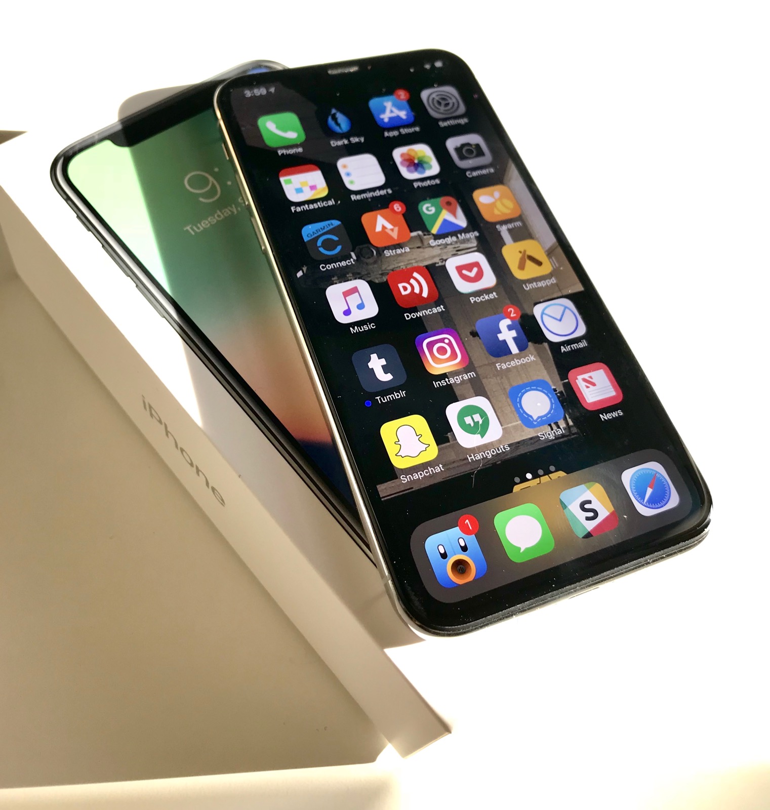
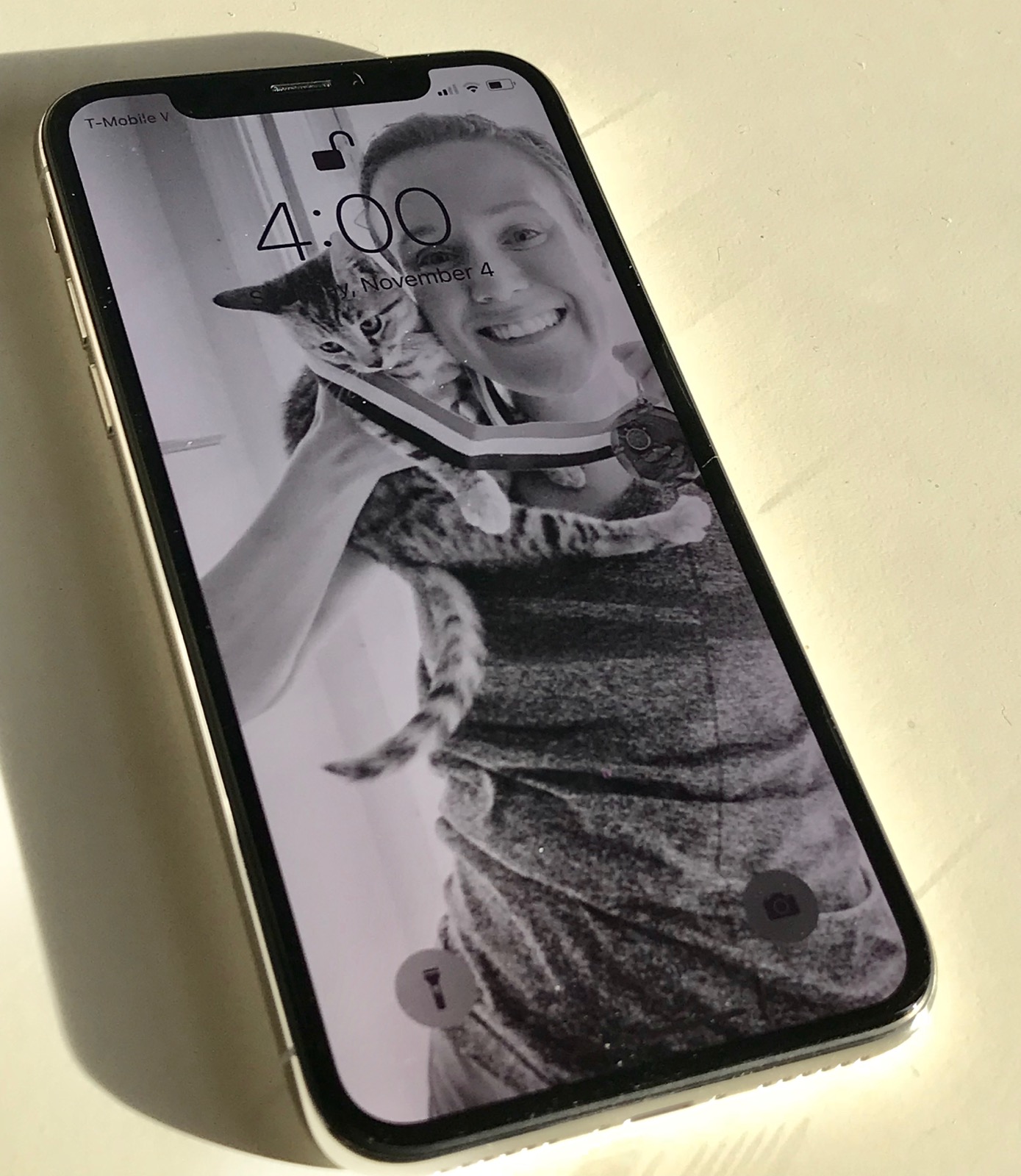
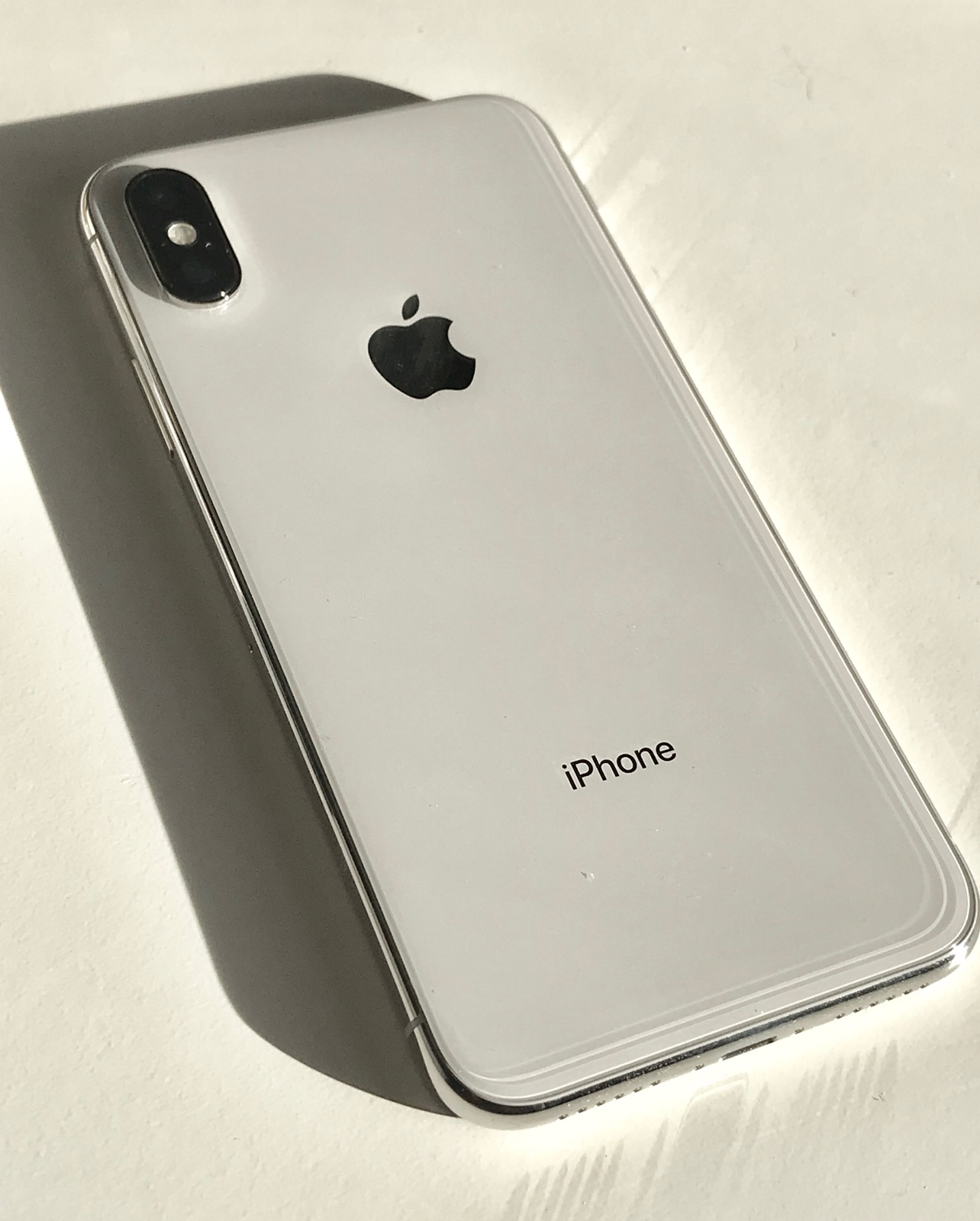
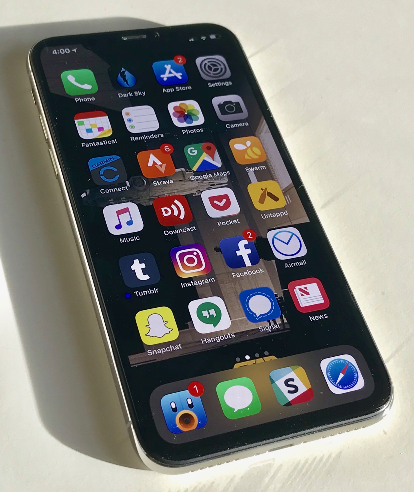
After about 24 hours with the iPhone X, I wanted to write up some of my initial impressions of the phone. It’s the biggest change to the iPhone ever and I’m sure there are a ton of people who have a lot of questions.
For reference, I’m coming from an iPhone 7 Plus which, while unwieldy, had become something I’d gotten used to using.
First, after just powering on the phone, it feels really nice in your hand, almost like you’re just holding a screen. However, the “bezel-less” descriptor is not apt. There is still a bezel around the whole phone, it’s really just a removal of the iPhone’s chin and forehead. I actually like the little bit of bezel around the edge, though. It acts as a frame between the screen and the environment behind it. I’m not a huge fan of the Samsung Galaxy S8 design with the curved screen around the edge. I think that looks and feels awkward. So I’m glad for the bezel that is here.
The question about how annoying the notch is… it’s fine. Honestly, I don’t even notice it. It’s there, for sure, but it’s mostly up and away from where I am typically focusing on the screen. I do wish there was more space in the status bar, though. I miss not having the battery percentage or Bluetooth indicator. It’s all there if you pull down Control Center, though.
Speaking of Control Center, I’m not a fan of the new gesture to invoke it. Pulling down from the top of the screen is more awkward to me. I’d have much more preferred if Apple had used the same gesture from the iPad Pro where you swipe up all the way from the bottom. It could either have been an extension of the multitasking gesture where you just swipe further up or Control Center could have hung out to the right of your open apps like it does on the iPad Pro. Considering how much I use Control Center, this will take some getting used to.
As for the rest of the gestures and the removal of the home button, they’re great. The new multitasking gestures are pretty much perfect and feel natural to me. They took no getting used to. Swiping along the bottom of the screen to go back to the last app is super smooth and way better than anything before, even the 3D Touch swipe that I loved. I already don’t even miss the home button. Even after 9 years of using an iPhone, I don’t reach for it except to try to orient the phone as I pull it out.
Getting back to the screen, this is the one area where I have really mixed feelings. It looks really nice head-on, as good as any other iPhone. However, I notice blue shifting when looking off axis much more than I had hoped. It’s still good as far as OLED screens go, but it’s there much sooner when tilting the phone than I had expected.
I’ve also noticed that text looks like garbage while scrolling quickly. Almost as it there is no anti-aliasing at all or as if it’s dropping frames. However, as I’m typing this, I just tried to reproduce it and I can’t. Maybe it was just some weird hiccup while the phone This may not actually be an issue. ¯\_(ツ)_/¯
The design choice to leave empty space below the keyboard feels a little weird, but in usage, I think it makes typing easier than if Apple had put the keyboard all the way dow n at the bottom. The emoji and voice dictation buttons have been moved to this space and it’d be nice to see it used for additional things as well. Interestingly, my typing seems more accurate with fewer typos. This is especially interesting to me after coming from a Plus-sized iPhone with a wider screen and bigger keyboard. I seem to make fewer of my standard iPhone typos—hitting i instead of o and n instead of space. Maybe this is just thanks to the slightly different position of the keyboard in relation to my hands.
Okay, now let’s talk about FaceID. It’s good. Not perfect, but good. Maybe even really good. It’s generally pretty quick and, when it works properly, feels like you don’t have any security on your phone at all. You can tap the screen to wake it and just immediately swipe up. Don’t even wait for the lock to turn.
However, it seems to have problems with my sunglasses. I just wear a cheap $3 pair of sunglasses from Target and I’m sure this is very much a “your mileage will vary” kind of thing. With my regular glasses, though, there’s no problem.
Where FaceID has been breaking down for me is when I’m not looking at my phone head on. It picks up your face from a pretty good angle at the bottom, nearly 45º, but from the sides or top, it’s not nearly as good. If you often use TouchID to unlock your phone while it’s laying flat on the table, this could be something you’ll have to change. I do this a lot and I find myself having to pick the phone up to tilt it towards my face.
I’ll say this, though, in the last 24 hours, I’ve only had to enter my passcode two times. Which TouchID, I typically have to enter it around a dozen times a day.
FaceID does make notifications from the lock screen nicer. I have it set to hide the content of each notification until it recognizes my face. While this sometimes means there’s a half a second that I’m waiting before I can read notifications, usually due to not having the phone up to my face yet, it does serve as an additional visual indicator that the phone is unlocked. Once the phone has recognized your face, you can just tap a notification and it opens. No more having to tap and then move your finger down to TouchID. This is rather nice.
As for Animoji, it’s impressive and fun to play with and I’m glad 💩 is one of the options. I’ve been enjoying #AnimojiKareoke a lot. But beyond that, I expect the novelty to wear off quickly.
Overall, I’m really digging the iPhone X. It feels nice to use and the screen sucks you in. However, apps that haven’t been updated for the iPhone X and don’t make use of Auto-layout look pretty rough on the screen. I’ve seen some people say they just look like you’re using an iPhone 6/6S/7/8, but they feel worse than that to me. It’s worse than when apps weren’t updated to run on the iPhone 6 and were just scaled up. Instead, it reminds me of back when the iPhone 5 came out and apps weren’t updated for that screen size. It feels janky, but most of the apps I use regularly are already good to go.
All that said, what it comes down to is whether or not it’s worth $1000. That’s a tough question, but not because it’s not a great phone. It’s a tough question because it’s not really $1,000. $1,000 gets you the 64GB model, but if you’re getting this phone, you’re probably going to want the 256GB version for $1,149. And then on top of that, you’d be stupid not to get AppleCare+ unless you’re one of those weird people who have never once dropped a phone. That’s another $200, but if you Google the cost of screen repairs for the iPhone X, you’ll see why you need to just spend that extra money upfront. Now, you’re at $1,350, before tax
So that’s the question, is it worth $1,350. That’s more than my iPad Pro with keyboard cover and Apple Pencil. That’s more than an entry-level MacBook Pro. That’s a lot of money and I don’t know if I can answer this for you. I’m really liking this phone and I don’t have any buyer’s remorse. If you have the money and you want it, then you should get it. But it’s more than rent for a lot of people and it’s, honestly, just a luxury item. If you don’t have the money, I don’t think it’s worth being the thing you save up for. Next year, all new iPhones will likely follow this design. While you’ll miss out on Animoji for a year, that’s probably the only thing you’ll really be missing.


